What I was trying to achieve: see a post properly
The problem was specific. I needed the archived HTML and the generated Markdown side by side, with the validation issues visible, without constantly switching files. Three things in one place. The scripts gave me none of them.
I brought Claude in to build it. The plan: two apps.
What I planned: separate concerns, separate tools
App 1 would be the HTML reviewer — load a post in an iframe, run the scan checks, show the issues overlaid on the rendered page. App 2 would be the MD reviewer — HTML on one side, generated Markdown on the other, with a staging workflow for accepting or rejecting the conversion.
Claude and I built both in the same session. App 1 got asset scanning alongside the content checks — whether every image had been localised to disk, how many were broken. The issue highlighting overlaid CSS outlines directly on the iframe so the problem was visible in context, not just flagged in a list. App 2 got a diff view and the stage/accept/reject cycle.
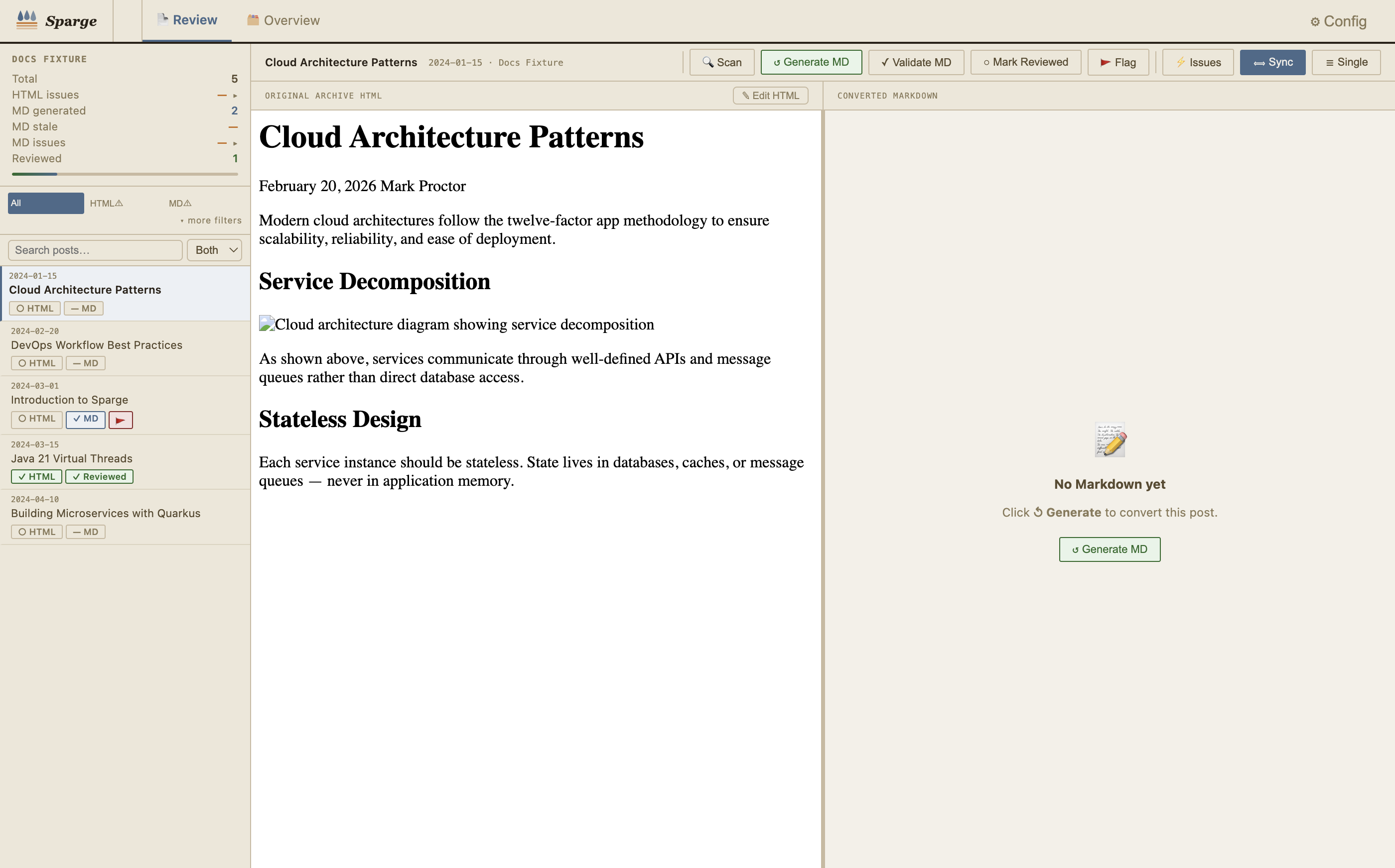 The merged tool: archived HTML with CSS issue highlights on the left, generated Markdown on the right, issue panel far right.
The obvious merge
Halfway through App 2 it became clear these were the same tool. A post has HTML to review and Markdown to generate and validate — no reason to open two applications.
I merged them. One server, one UI, two panels, shared action bar.
The inline highlighting had been Claude’s addition to App 1, something I hadn’t asked for explicitly. It turned out to matter more than anything else in the design. Seeing where the tracking pixel was in the rendered post — not just that one existed — was the difference between fast review and slow review.
That’s when I stopped thinking of it as scripts with a UI on top.